Do you want to learn about printing and what works and doesn't when designing artwork for socks? Well, you're in the right place!
What are socks made of?
The socks on Redbubble are made-up of 58% recycled polyester (made from recycled materials), 22% nylon, 15% cotton, 4% spandex, and 1% rubber.
How are socks printed?
Your design is digitally printed onto the socks using water-based ink penetrating the yarns. The printers that are used by the 3rd-party fulfillers for socks don't have white ink. Because of this, we recommend designing artwork knowing there will be some normal ink bleed from the printing process so that when the sock stretches, your design still looks great.
Dos and don'ts for designing socks.
You’ll want to keep a few things in mind when designing artwork that works well on socks because of the stretchy fabric that conforms to the shape of your customer’s feet.
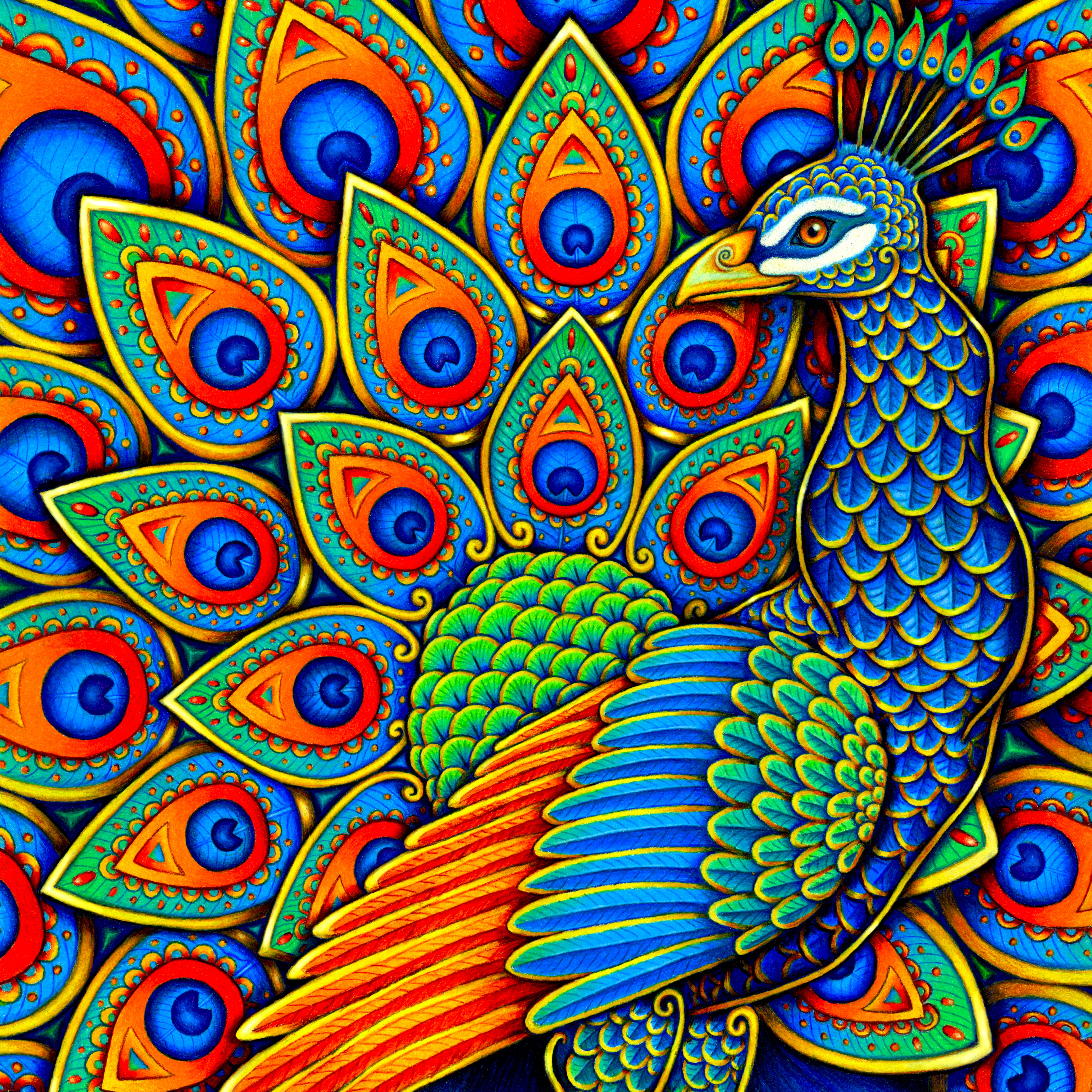
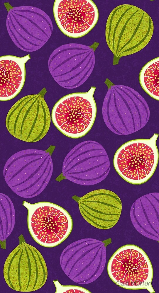
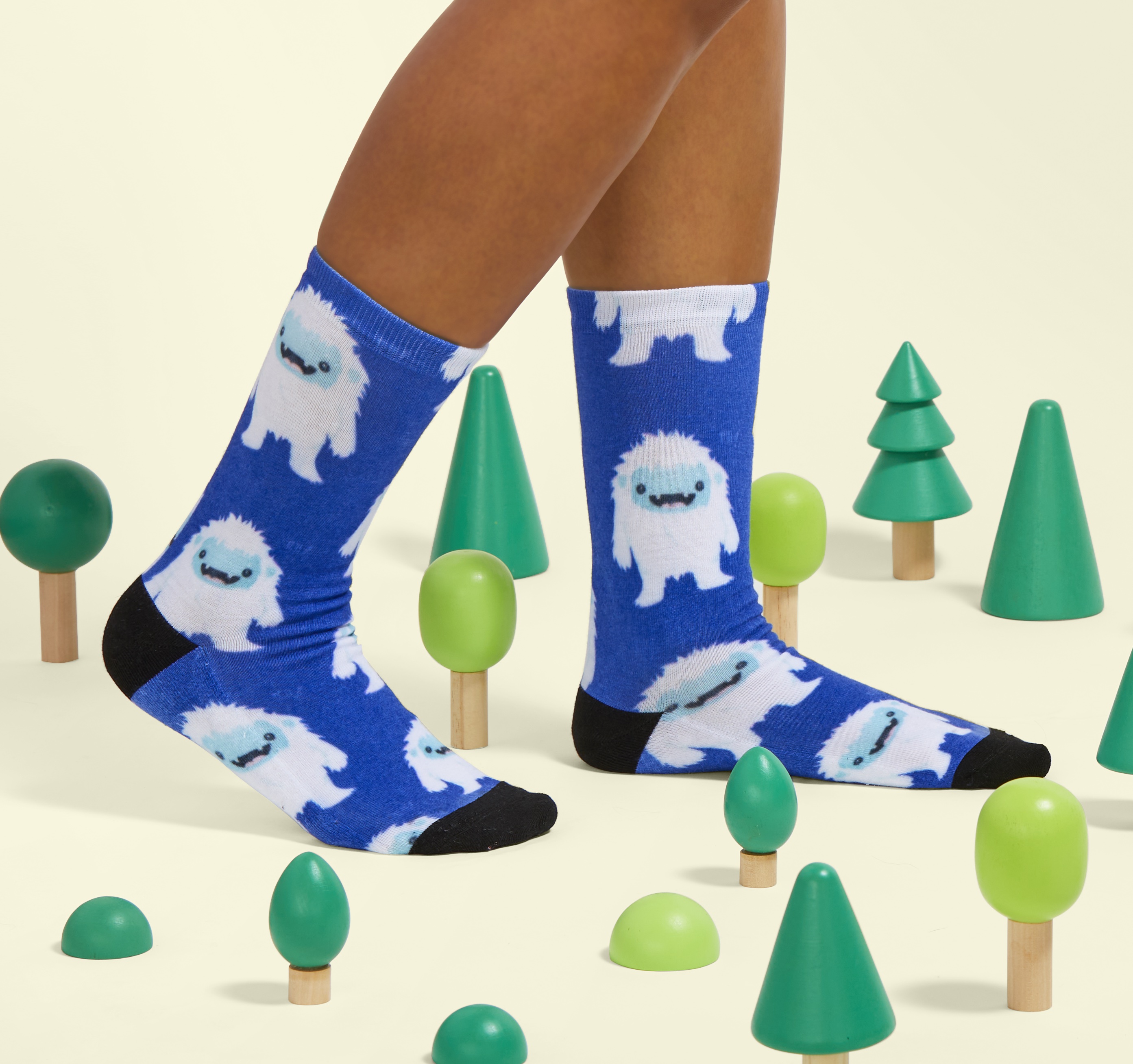
What works well
- Bold graphic designs using full color over the whole sock design template
- Bold, bright lines that aren’t too fine. Fine lines can get lost in the rib structure of the fabric, so bolder and brighter show up much better
|
|
|
|
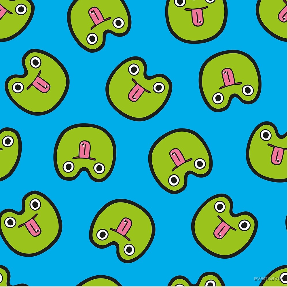
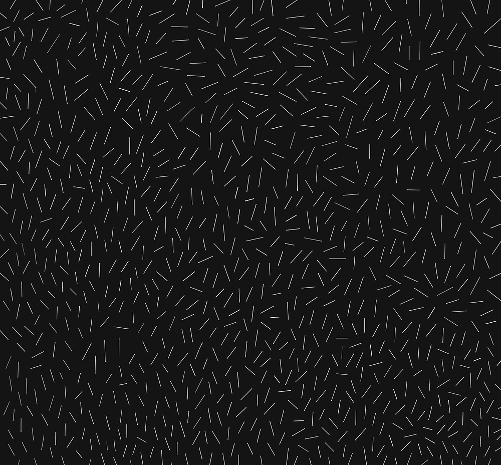
What to avoid
- Fine, thin lines in lighter colors against a very dark, bold background. These finer details will stretch out on the sock and not make for the best experience for your customer.
- Combining floating, stand-alone designs in bolder colors against a white background
Examples:
Using fonts
Here are some suggestions on how to use fonts in your designs for socks:
-
On white or light-colored backgrounds:
- Regular font is better than Bold
-
For Regular font, use 85 pt minimum
-
On bright or dark-colored backgrounds
- Bold font is better than Regular
- For Bold font, use 125 pt minimum
-
Cursive
- It works well for a visual effect but if you need the words to be legible, sticking with Regular or Bold font, with the guidance above, is your best bet
Using the color white
Think of it like this: the color white is the sock color itself, not a newly inked section like other colors, so take that into account when designing your best artwork for your customers.
Here are some tips if you use the color white in your artwork:- A larger white surface area in the design will show up better vs. a small area
- Designs with white that do not require as much definition in your subject matter will print up more successfully than white utilized in small doses. It’s hard to have crisp edges where color meets white areas of the sock, so fine, detailed white lines on dark backgrounds will almost always disappear when printed.
|
|
Happy designing!